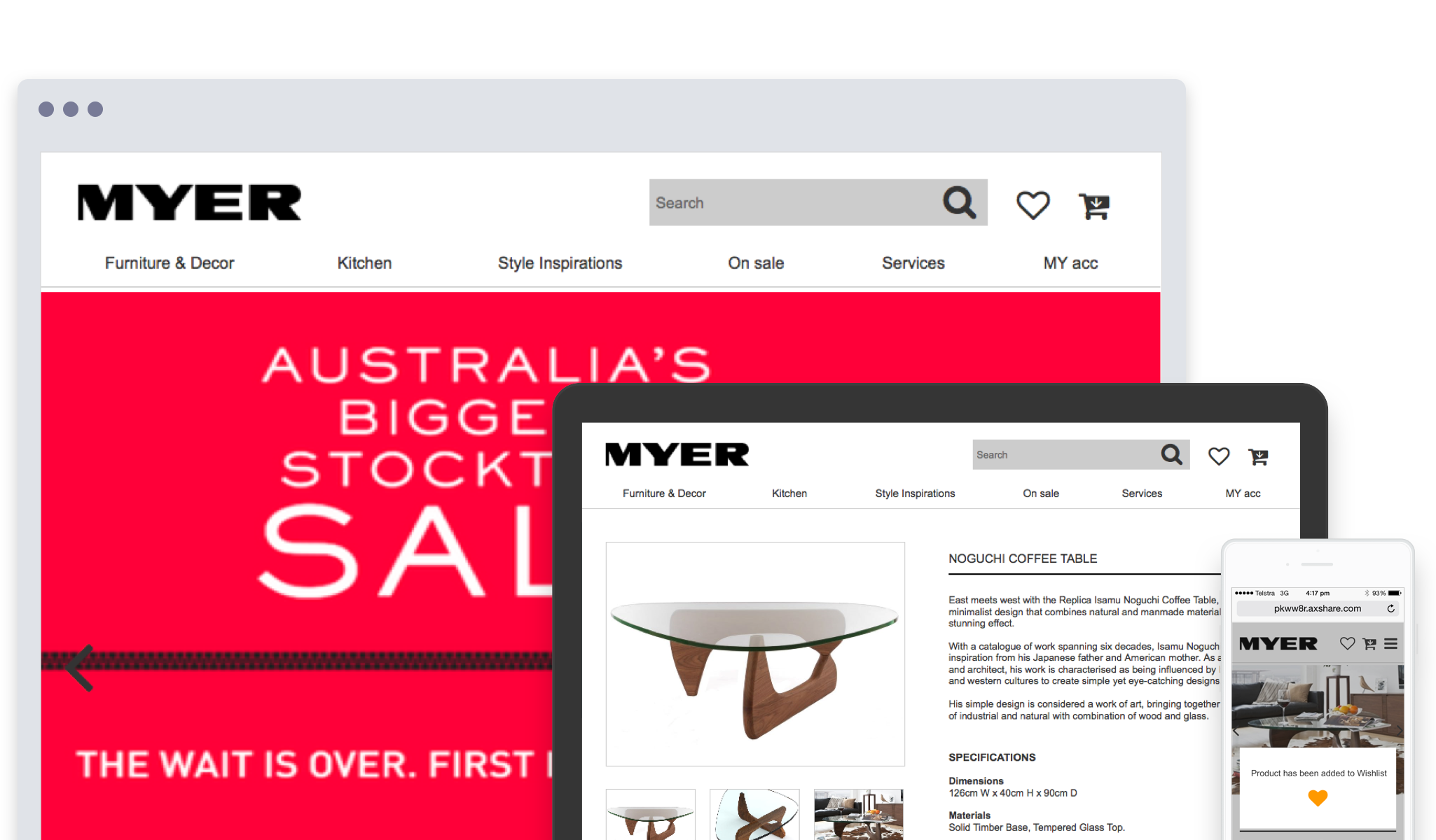
Project:
MYER home
Detail:
Student brief. Part of General Assembly curriculum
Activities:
Competitive Analysis, Wireframing, Design, Prototyping, Usability testing
Year:
2015 (2-week project per phase)
Background
As a leader in home decorating retailing, MYER has decided to expand its services to include additional planning and buying options for its customers through a microsite separate to MYER website. In addition to e-commerce features, the microsite (MYER home) should have features to help customers get inspiring room design ideas, save styles and plan for their decorating projects.
Challenges
PHASE 1 - Design a microsite (MYER HOME) with features to help customers get inspiring room design ideas, save styles and plan for their decorating projects.
PHASE 2 - Develop a responsive web design to accomodate customers’ browsing habits, which are no longer limited to desktop only, but also extends to mobile devices.
Approach
This was an individual project, so I did all aspects of UX design including reporting and presentation at the end of the project. My process was:
- Start with competitive analysis & identify opportunities
- Consider the user personas and their journey
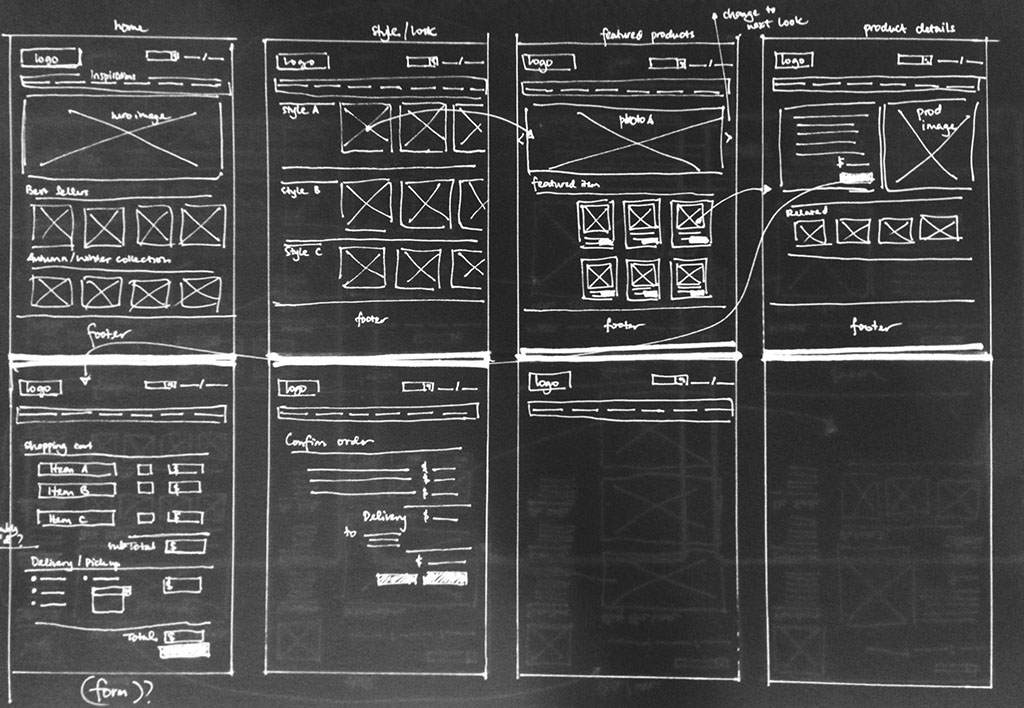
- Design ideation & wireframing
- Build & test the prototype
Competitive Analysis
A number of e-commerce sites were chosen for competitive analysis such as Bunnings, Freedom, Amazon, Ikea, Temple & Webster and Harvey Norman. They are either in general e-commerce industry or specific to home furnishing industry as MYER home.
I looked at their features (such as search function, style inspirations, subscription and wishlist) and evaluated them based on findability, ease-of-use, value and look & feel.
User persona & Journey mapping
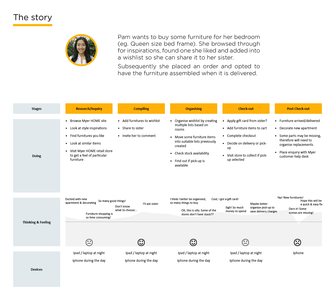
Three user personas have been provided in this project and I selected Pam, a 29-yo Medical Sales Rep.
She is busy, always on the go. What she is looking for in an online store is collections of items/style inspirations and to be able to see what’s popular and detailed product page. She doesn’t like a lengthy checkout process. In addition to that, her browsing habit shows heavy mobile phone usage (iphone). Hence, the prototype for responsive design on Phase 2 has been developed with the iphone in mind.
Phase
#1
Designing with rapid prototyping
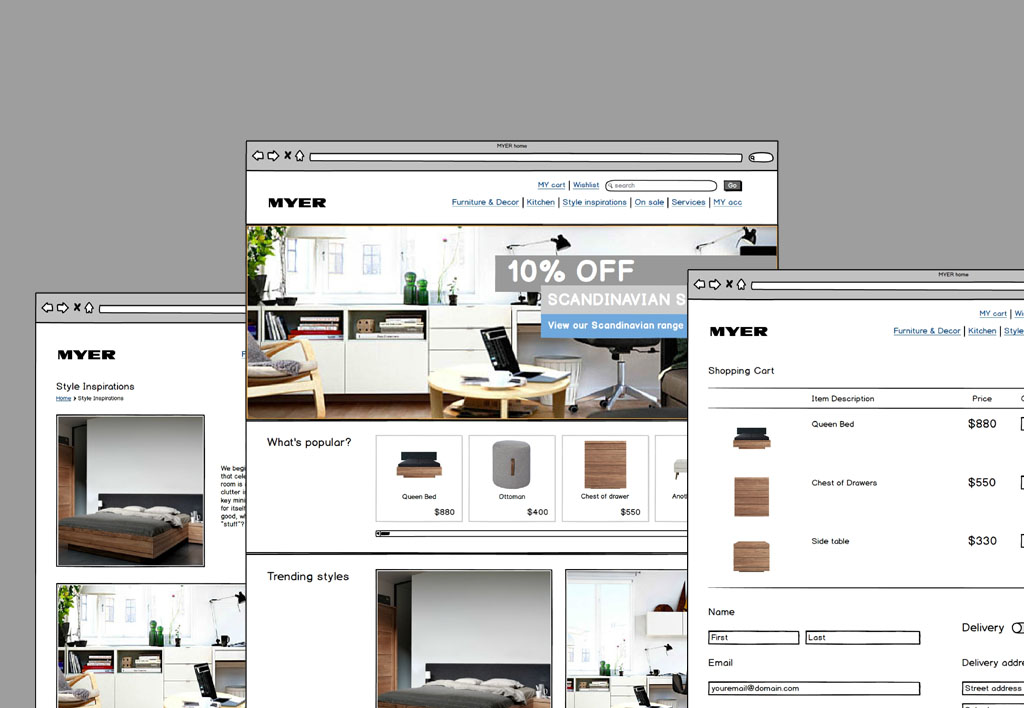
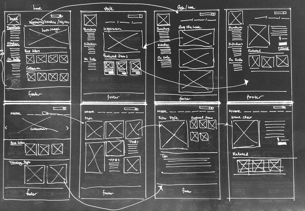
In this phase, I wanted to explore a typical user path in from finding a product to completing checkout and also sharing the product/idea to others. I developed the prototype with these purposes in mind. The relevant pages were created using lo-fi tool Balsamiq for usability testing.
Usability testing
Usability testing was conducted with 4 participants matching the user persona Pam. They were tasked to find a furniture item, add it to Wishlist and share it to another person. And then, they were to complete a purchase.
The biggest problem identified in usability testing was the sharing feature hidden in Wishlist. There was no dedicated Share button on Product page and participants were unaware Wishlist has option for sharing or have never used Wishlist before.
The testing also identified different user behaviours: 'browsing' vs 'searching'. This was highlighted as the prototype was only designed for browsers and the wording on tasks given to them was not specific enough.
Phase
#2
Looking at Wishlist
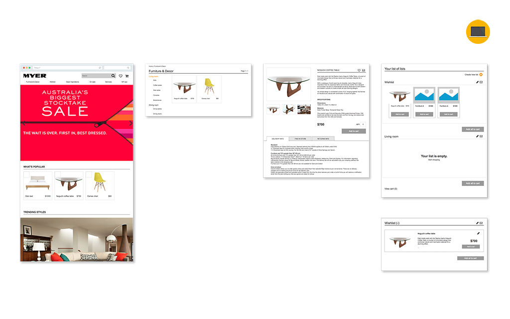
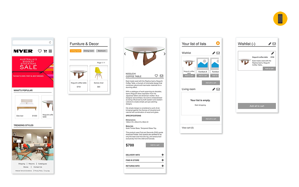
In the second part of the project, I focused on Wishlist and extended its feature to allow creation of multiple examples and organising them as how the user sees fit, essentially providing a way for MYER customers to curate their own favourite furniture items. Application examples would be creating and organising lists based on different rooms or favourite style lists.
Responsive Design
Before I began prototyping I first looked at how a typical product/item is represented on an e-commerce site.
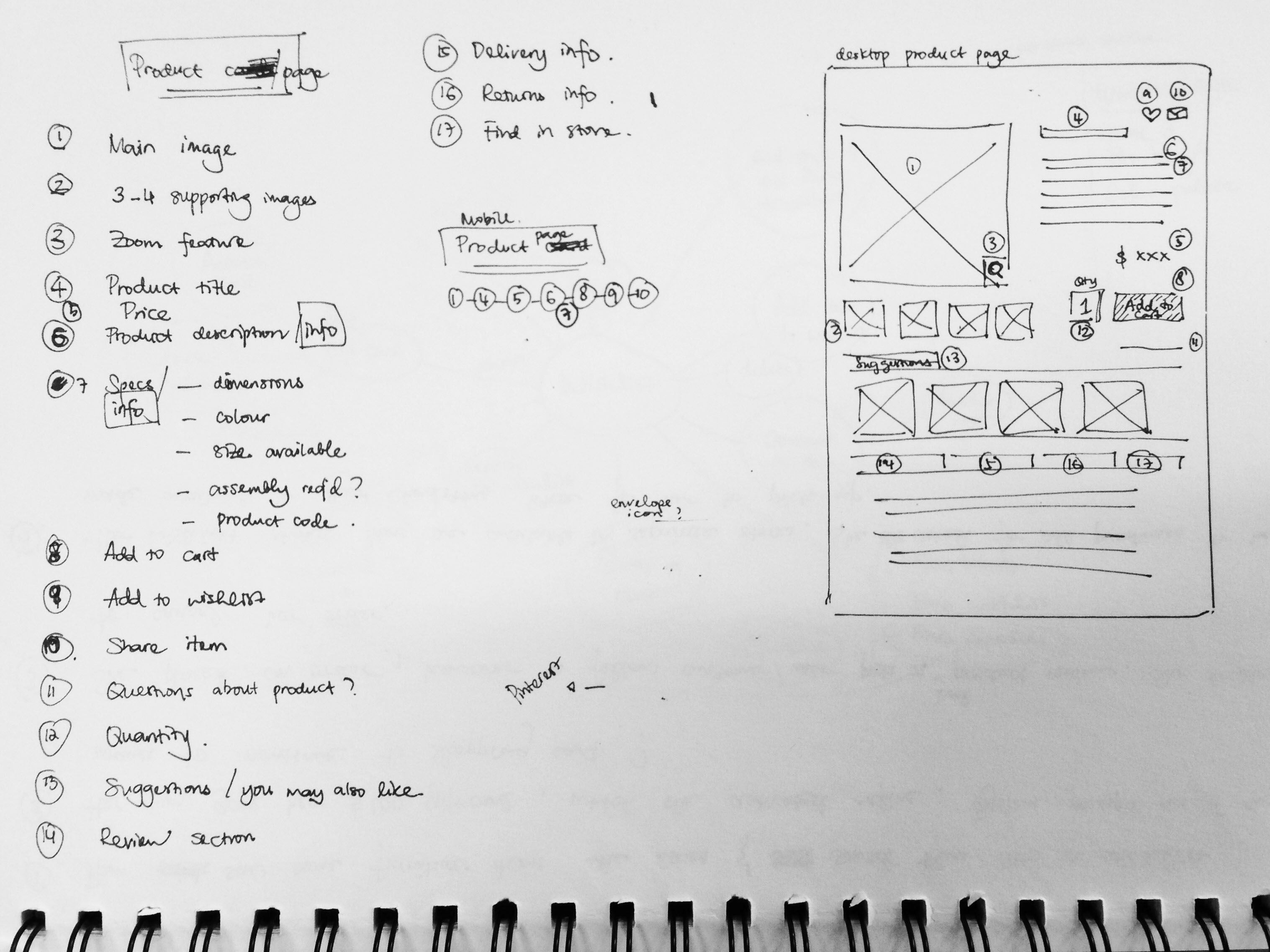
The main representation is the Product page, which contains the most comprehensive information about the product. There is also a Product card, which can be found in other parts of the site. The components are generally simplified and leads to the Product page. On a mobile page, the Product page only contains the mandatory information to accommodate the much smaller screen real estate.
By numbering the components on a Product page and identifying which are mandatory for mobile version, it gave me clarity when I eventually started prototyping.
Prototyping with Axure RP
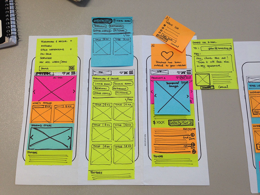
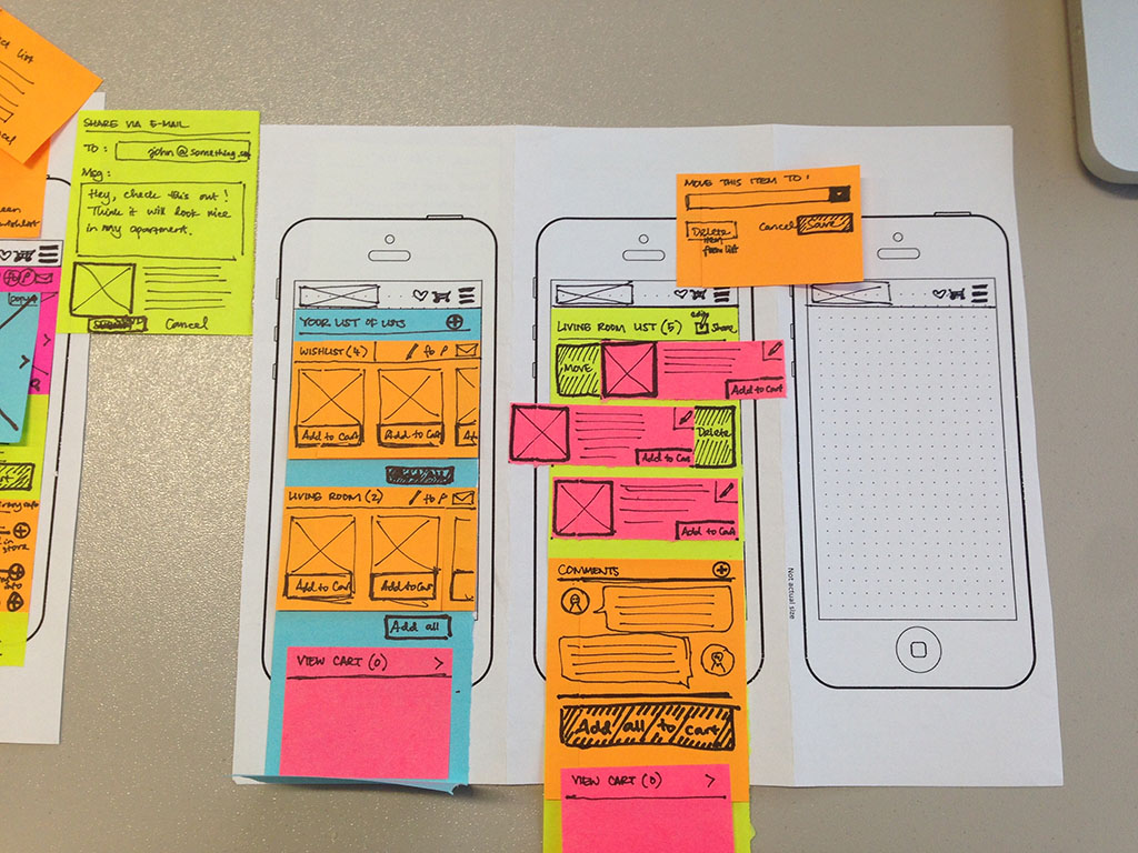
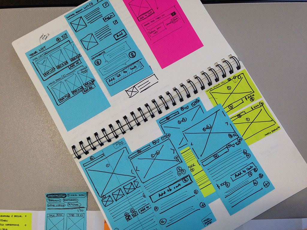
I initially started prototyping (with mobile-first mindset) using paper & post-it notes, simulating a lot of the interactions before moving to Axure RP.
Usability testing
I tested the prototype on five people - 3 people did the tasks on iphone and the rest on desktop.
They were given three tasks: Find a furniture item and add to Wishlist; check the Wishlist and re-organise it by creating another Wishlist and moving the item to the newly created Wishlist. The tasks were chosen to test how they would navigate and utilise wishlist feature.
When asked to move a product from one list to another, all participants preferred to be able to drag & drop the Product tile. This was identified in the early paper prototype development, however I wasn't sure if drag & drop could be done on mobile website. Furthermore, I didn't know if this could be emulated in Axure.
There were other things too, like the inconsistent feedback to users after they completed a task and the overall clarity on the design.