Project:
Distributing excess food to Non-profit organisations (NPO)
Client:
Yume App - Client project through General Assembly
Activities:
User research, Competitive analysis, Journey mapping, Wireframing, Prototyping, Usability testing
Year:
2015 (2.5-week team project)
Background
About 4 million tonnes of food is sent to landfill in Australia every year and about 1.8 million people go hungry each day without access to food. Yume aims to reduce food waste in cafes and restaurants by connecting those who have excess food and those who need it, either through donation or discounted sale of unsold or surplus food.
We have two primary objectives - to make it easier for NPO users to sign up to the app and to remove all barriers preventing businesses from donating and NPO from picking up food.
Whilst Yume currently have about 20 NPO signed up to them, the sign-up process for them was either ‘guided’ or not through the app.
My role
The project was a final client project as part of the User Experience Design Immersive (UXDI) course at General Assembly. I was part of 3-person team assigned to Yume. As one of the UX designers, my key responsibilities included user research, wireframing & co-producing high-fidelity prototype using Axure, annotating wireframes and user testing.
Approach
After kick-off meeting with the client, we decided to approach the project from 5 different areas:
- Understanding the current Yumeapp
- Looking at food sharing organisations such as SecondBite and OzHarvest
- Also network business models such as AirBnb and Uber
- Research community activities in Melbourne requiring food donations
- Who is the user? What are their needs/pains/priorities?
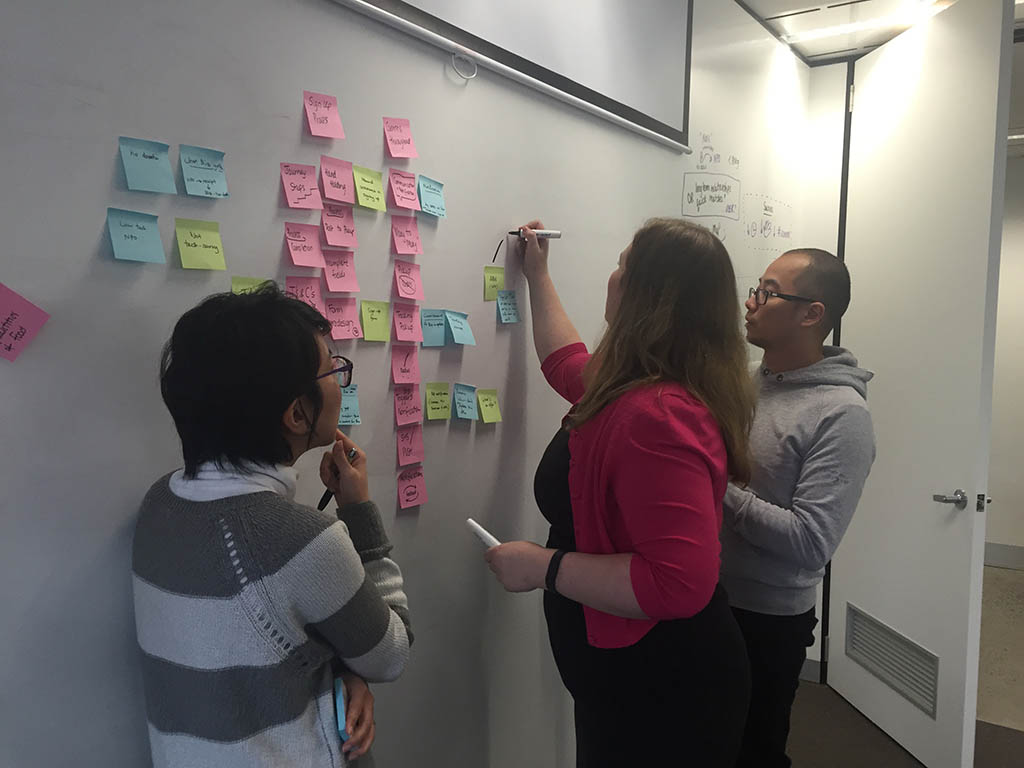
Discovery
We did comparative analysis on apps like AirBnb, Uber, Pareup, Groupon and Skip app to see how they do the sign-up process. Also to understand the network model, particularly in the case of AirBnb and Uber.
Our initial inquiries with our client and various charity organisations/community groups such as Asylum Seeker Resource Centre (ASRC), Salvation Army, St Vinnies, Sacred Heart Mission, etc led us to focus on an older woman as our primary user, however the direction was later changed after further discussion with our client.
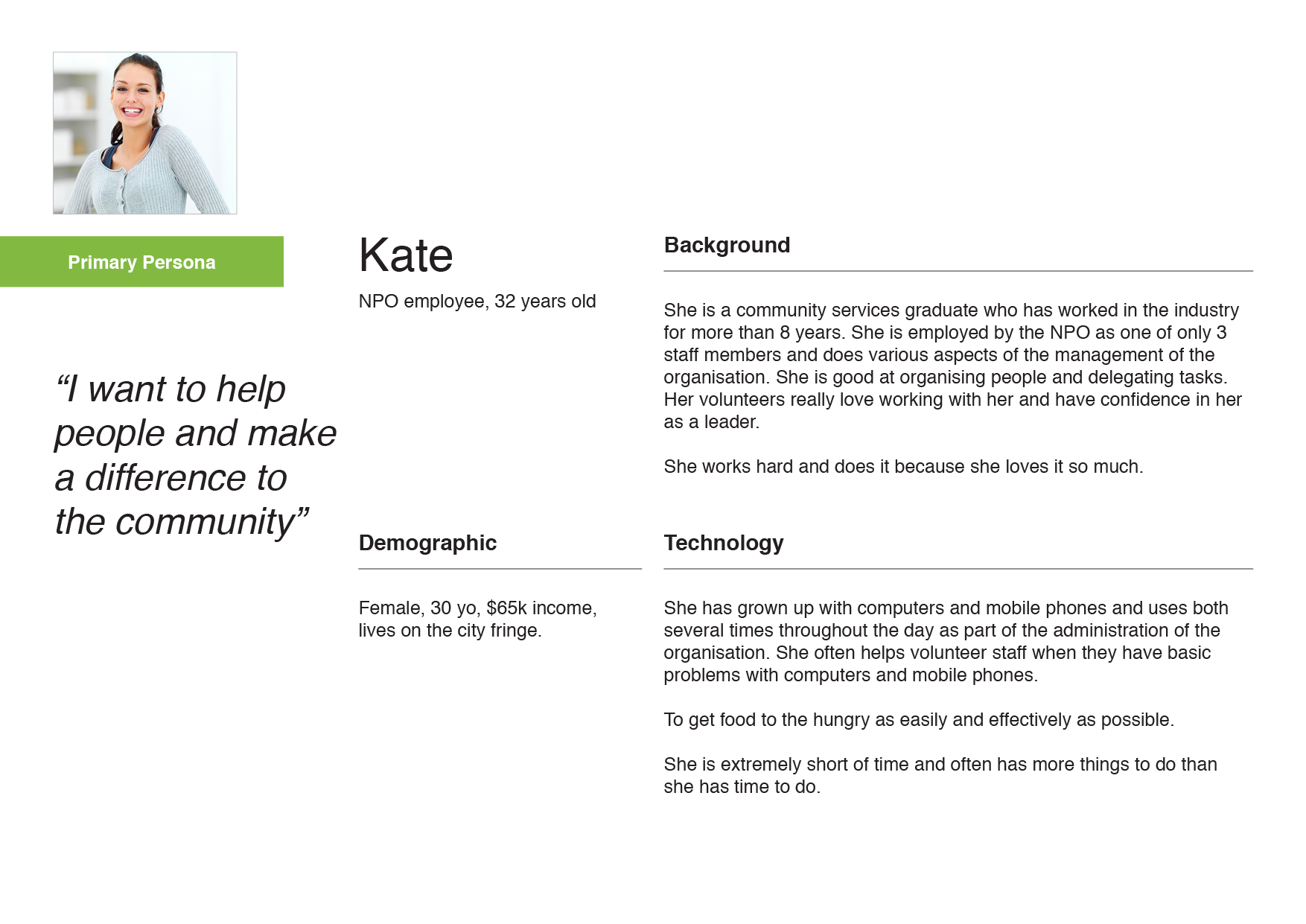
We realised the decision makers at NPO are employed by the group and they are the users, who most likely would undertake the sign-up process with Yumeapp. Their characteristics were more consistent with a tech-savvy, university-educated women in her 30s. Therefore, we identified the Primary Persona 'Kate' as our focus on design recommendations and usability testing.
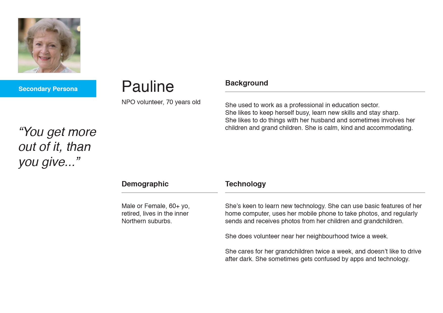
We also identified a Secondary Persona 'Pauline', whom we need to accommodate on the food collection aspect of customer journey. She is a senior volunteer with limited technical capabilities, who recently had a plastic surgery to look like Betty White.
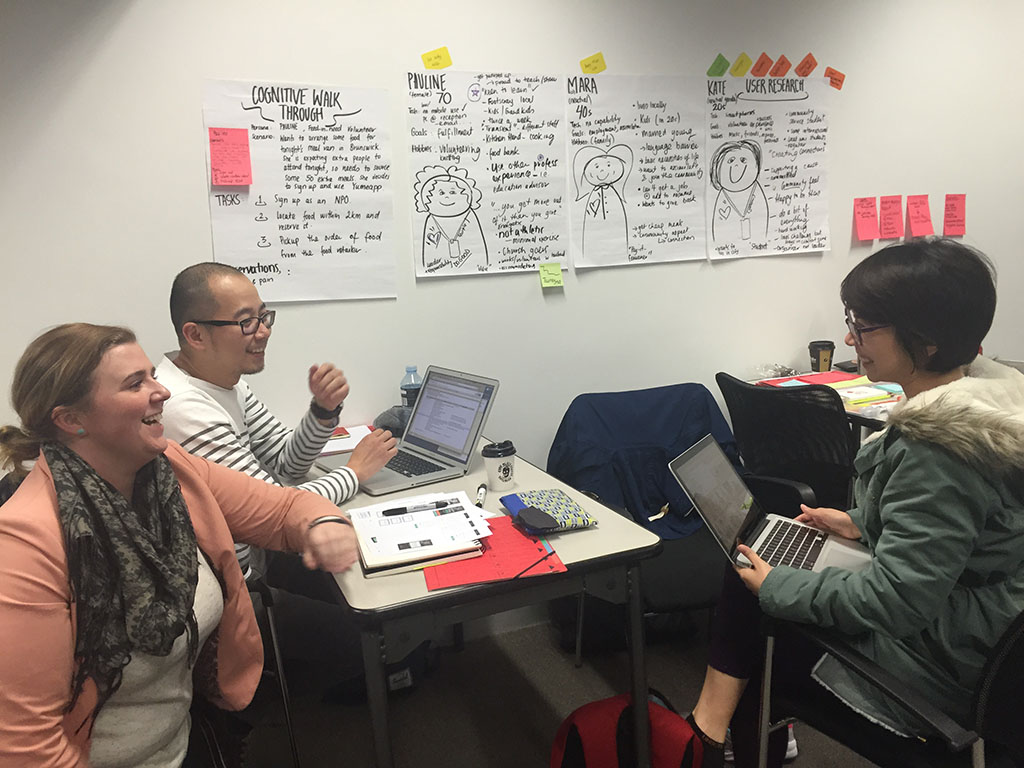
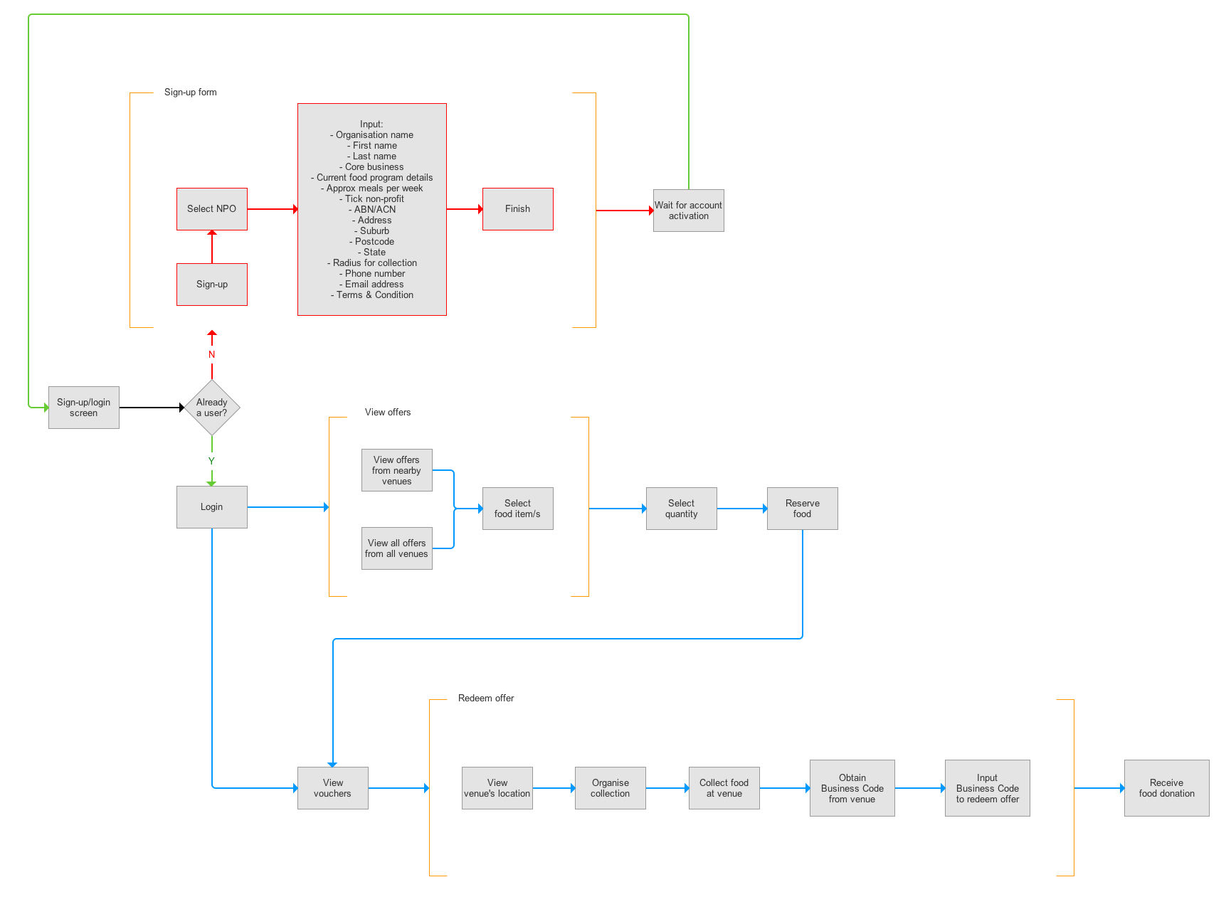
Understanding the app & user pain points
I mapped out the user flows of the current app and I also carried out an expert review of the current Yumeapp in the form of cognitive walkthrough as Kate. This included creating a scenario, where Kate would need to sign-up and use Yumeapp. The outcome of this exercise is to gain understanding of the user needs, pain points and motivations, which guided us in our design.
Ultimately we set out three things to achieve:
- Make sign-up easy for Kate
- Help Kate find the right food offer
- Make food collection easy for Pauline
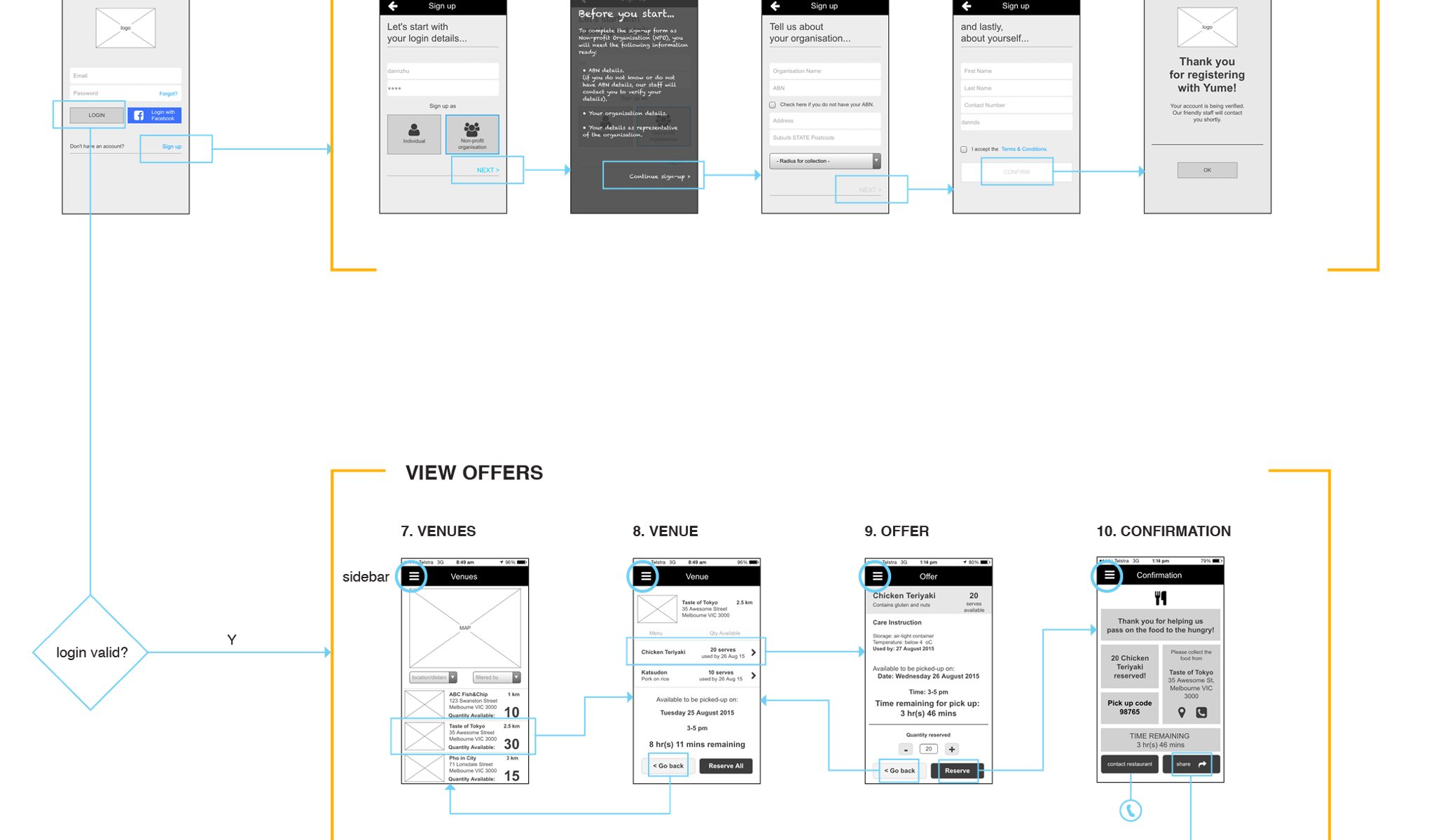
The sign-up form
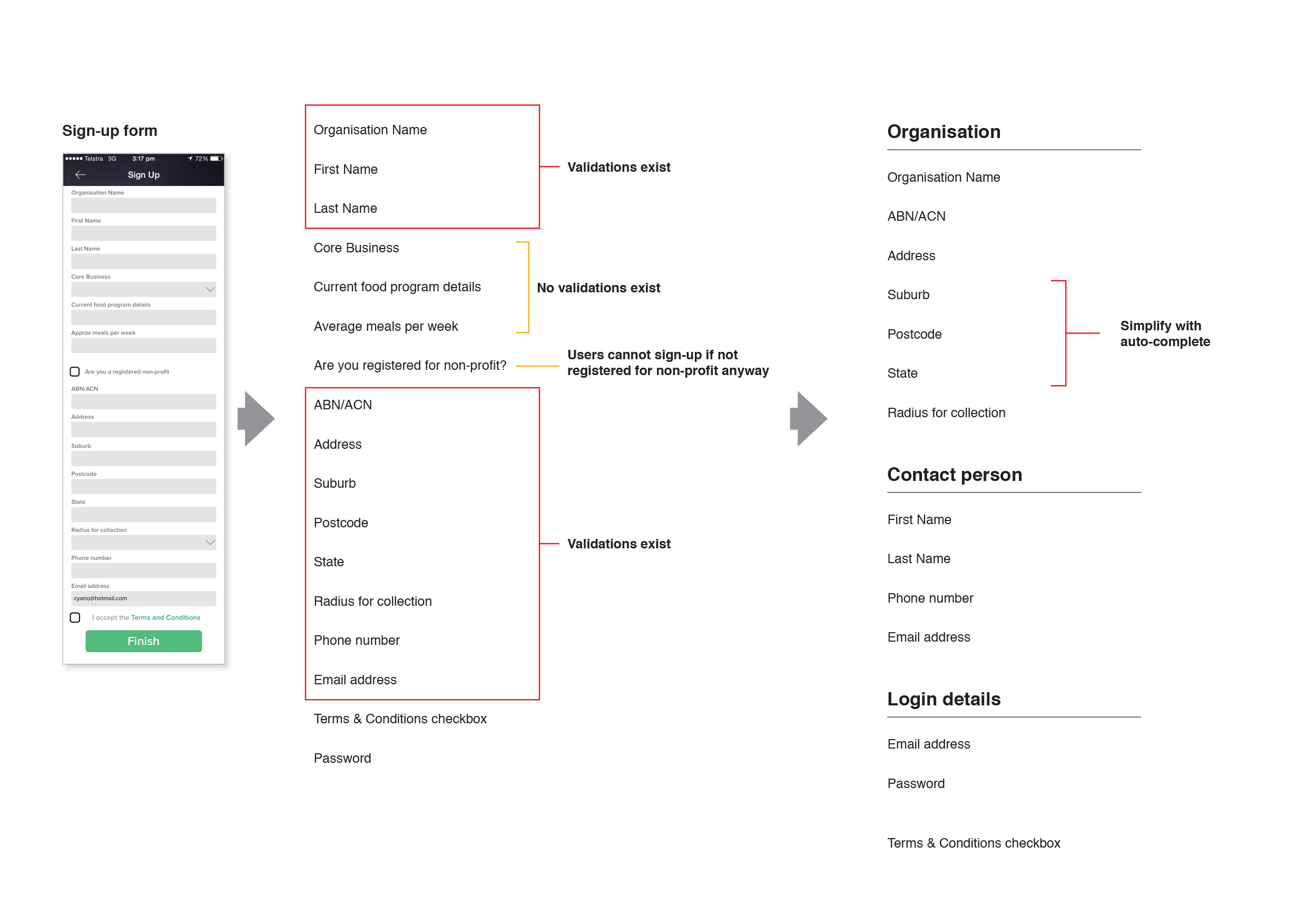
The current sign-up form on the app feels overwhelming with the number of fields users have to complete before clicking 'FINISH' button. Almost all of these fields have validations and ABN being the biggest hurdle for users.
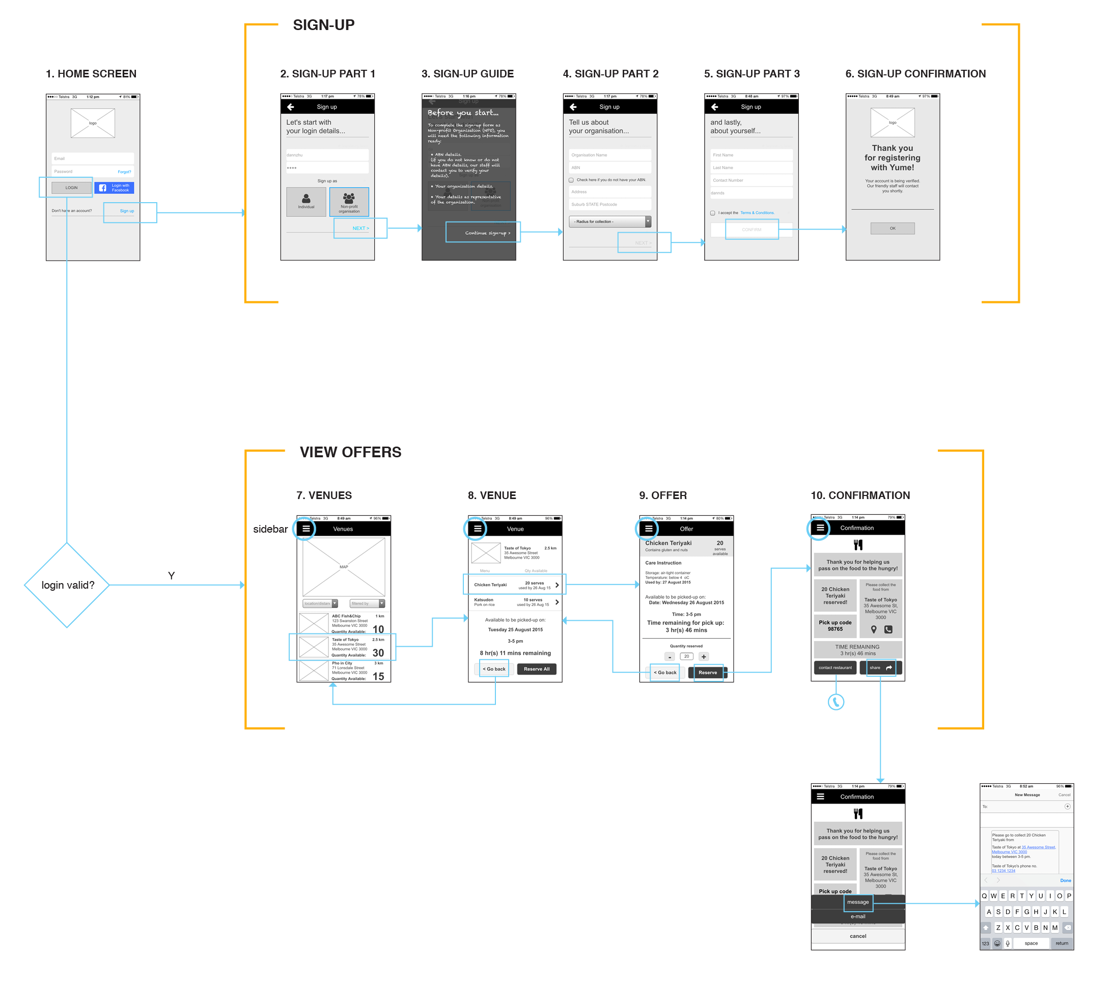
So I simplified the form by breaking these fields into stages to make it less overwhelming. First, I took out the fields that were not important or being used. Then the remaining fields were re-organised into appropriate categories, which resulted in 3 stages of sign-up. Further simplification was done by grouping 'Suburb', 'Postcode' and 'State' into one auto-complete field.
Iterating the design
We did two iterations of prototypes, which we did usability testing on. Usability testing was conducted to see whether users could easily create an account for their NPO, and then locate and reserve donated food, as well as passing on the confirmation to another person to collect the food. During the sign-up process, we also tested the option of “no ABN” to determine if it eliminated a barrier to sign-up. In addition to that, we tried incorporating contextual help in the form of sign-up guide, to assist users on what is required when completing sign-up process. This didn't work as users don't read the guide.
Picking up food was an issue identified by Yume in the initial meeting. The process required a business code to be entered upon collection of items. However, in the situation of an NPO, a business code would likely not be necessary. This task was designed to test the changed confirmation with contact and forwarding function.
Next step...
The final design concept v1.2 that we recommended detailed several key changes such as flexibility to sign-up without ABN and opening up communication between the business/donors and NPOs. In addition to that, logistic partners could be leveraged or volunteer drivers could be introduced to assist delivery.